Architecture Visualization
Content
Introduction
This feature allows its user to generate detailed end-to-end diagrams to offer a visual representation of your system's processes and logic. Furthermore, pinpoint issues with ease and facilitate swift problem-solving. Visualize data flows and dependencies to enhance clarity and streamline decision-making. Analyze and optimize individual components efficiently without extensive navigation. Identify and prevent potential logical loops in your system by accessing metadata and component links easily. This ensures seamless integration and reference. Furthermore, gain valuable insights into best practices for plugin and extension development, empowering you to enhance your system's capabilities with confidence.
Please ensure that you have configured your integrations. See here: Integrations
System Visualization
Auto-generate end-2-end diagrams of the entire system’s process and logic
Identify issues through the generated diagrams
Visualizations of data flows and dependencies
Understand component details without skimming through your environments
Identify potential logical loops
Find associated metadata and links to components
Step-by-Step Instructions
Below is an example illustrating how to adapt the process for your system's components.
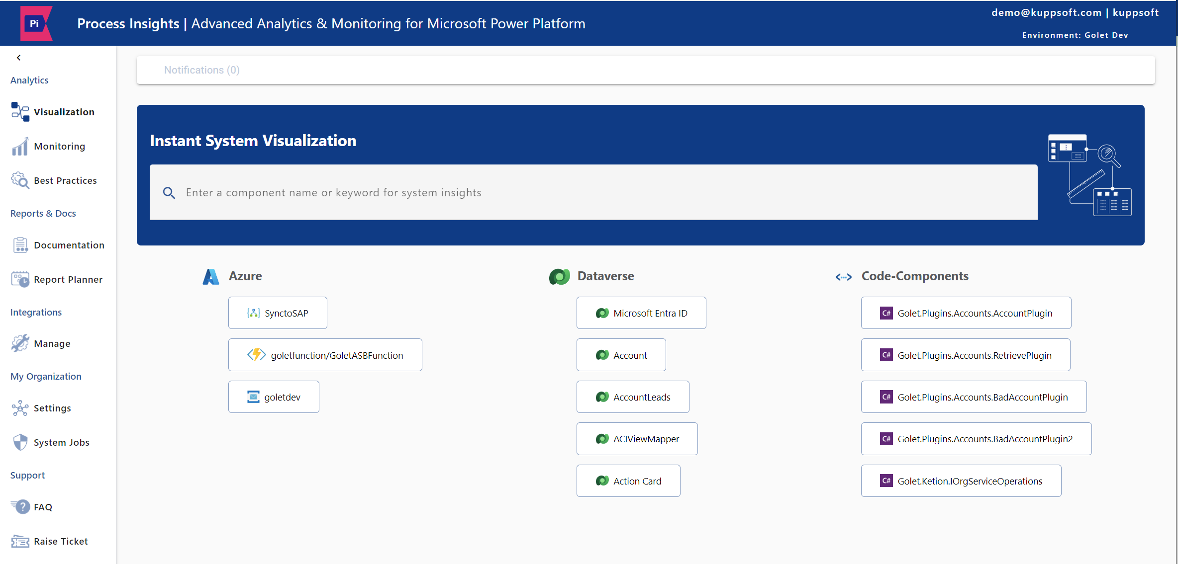
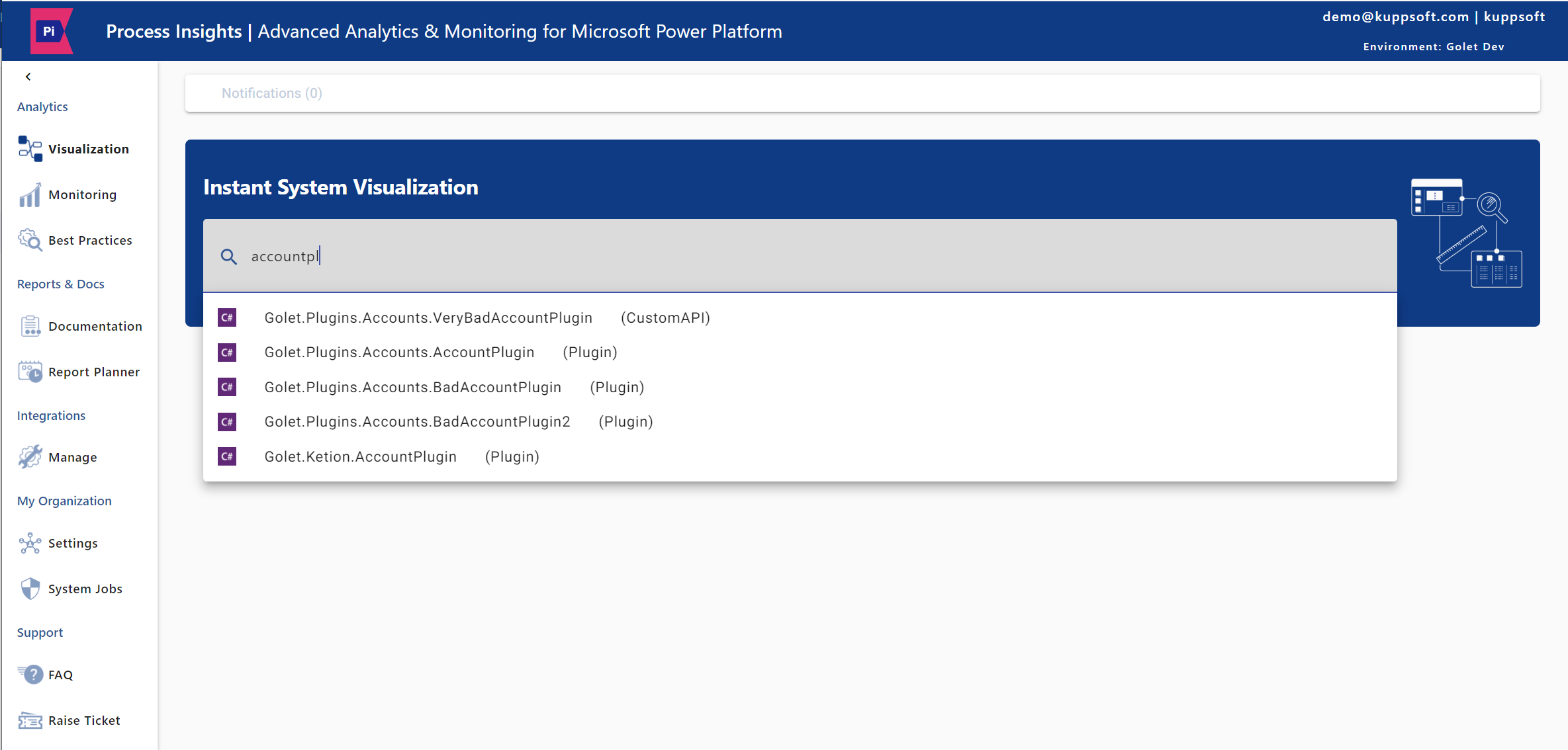
The Visualization feature allows for searching components loaded into the cache. In this example, the “AccountPlugin” is examined as a component within Dataverse.
Step 1: Enter a component name or desired keyword in the search bar. Click on the component name when it appears.
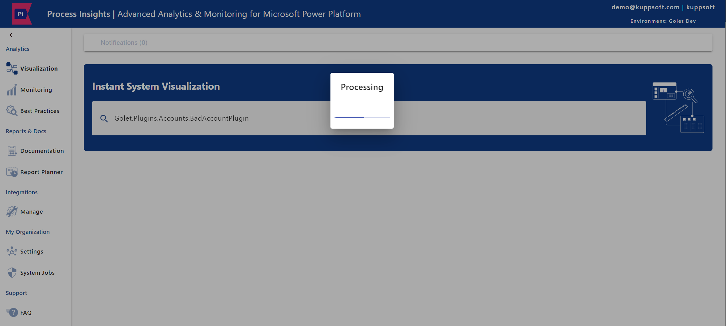
Step 2: Wait for the analysis to complete and for the component to be visually displayed.
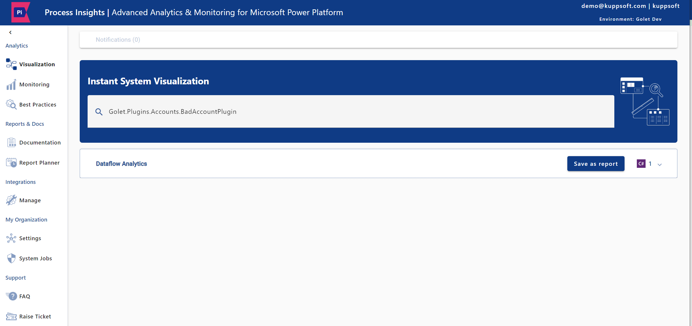
Step 3: Once done, click on the component name again to open the diagram with the visualized components.
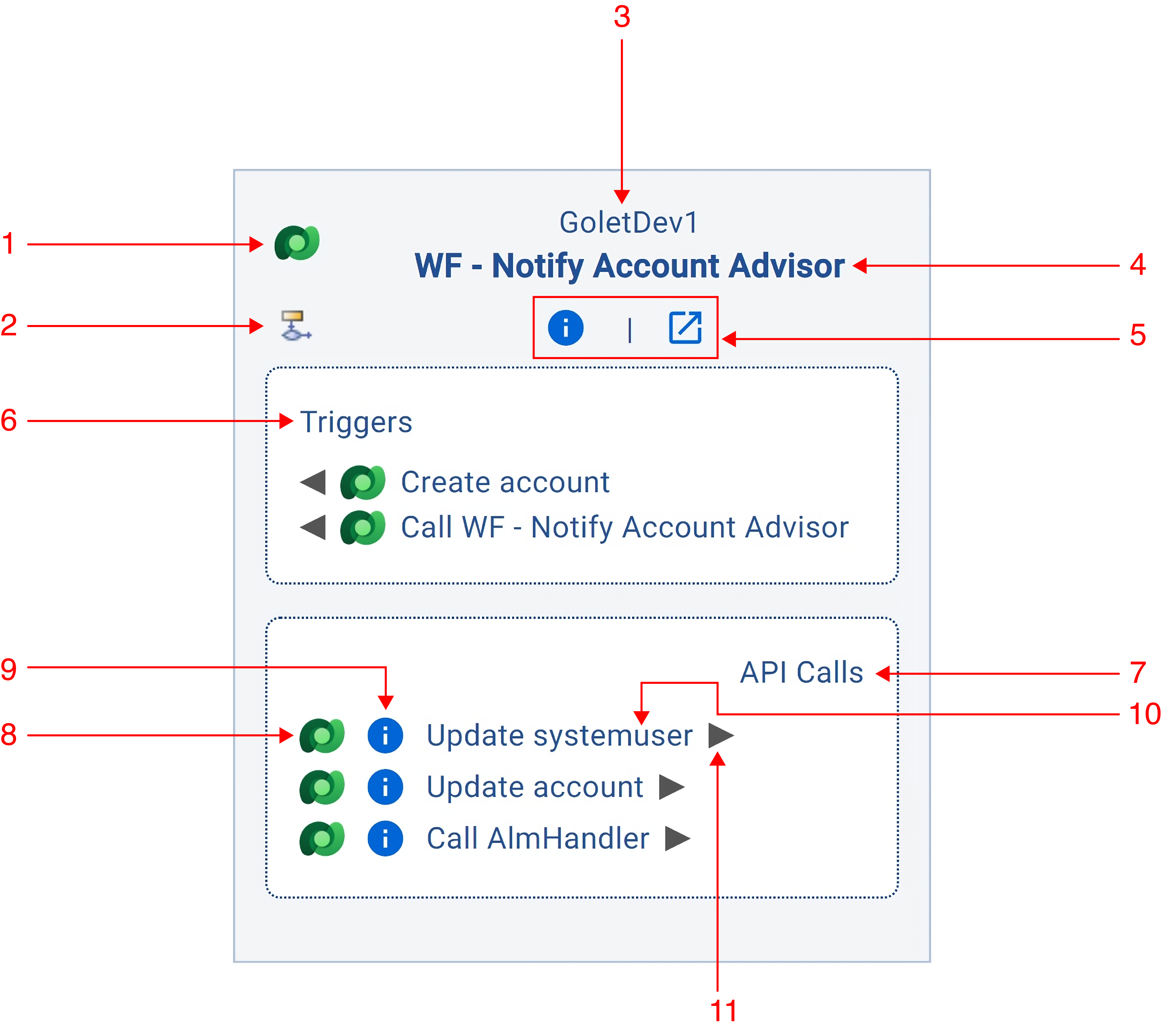
Step 4: The diagram box will provide the detailed information you need through visualization.
Component's source. In this example, it refers to “Dataverse”.
Component type. In this example, it refers to “Workflow”.
Related source name to the component. In this example, it is ”GoletDev1”.
Component name
Detailed information. See Step 5 below for more details.
Events that trigger the component
API calls are used by the component
Related source to the event
Details about the event
Event name
Visualize the event
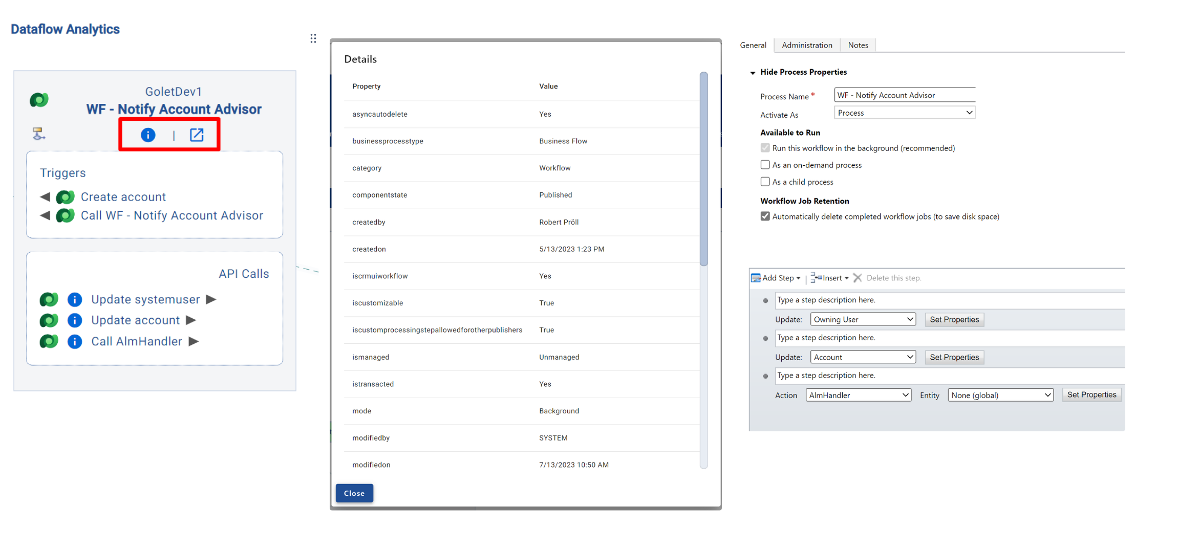
Step 5: For additional details about the component, click on the 'i' icon or the extend icon. In this example, it refers to Workflow.
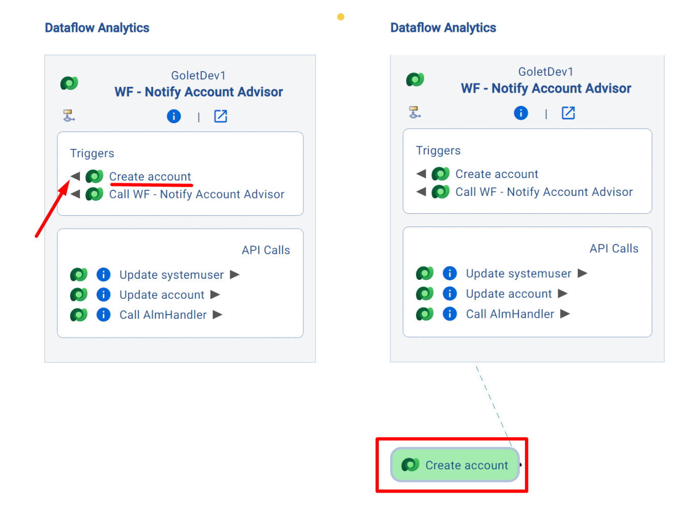
Step 6: To analyze the 'Create Account' event and identify the affected components, click on the triangle icon ( ). Then, click on the “Create Account” event to analyze the affected components.
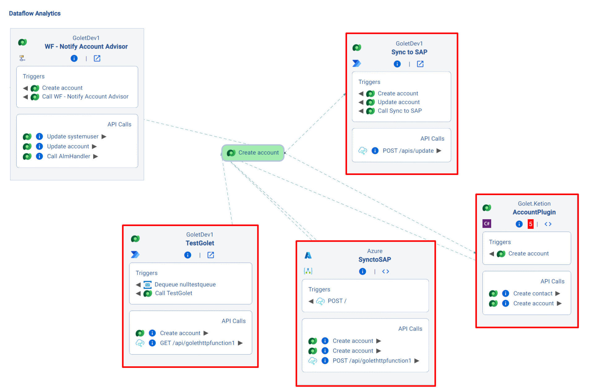
Step 7: Once finished, you will see the components that are affected by the “Create Account” event: “TestGolet”, “Sync to SAP”, “SynctoSAP” and “AccountPlugin”.
This feature visualizes relationships and dependencies between components and events, while also providing insights into potential problem areas.
Remove elements from the Visualization
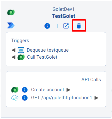
Components can be removed by clicking the delete button on the component.
A Dataverse event can be removed by right-click with the mouse at the event.
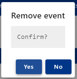
Then a dialog will show up, asking if the user wants to remove the event.
Best Practice Violation in Visualization
Best Practice Violations are implementations within your systems that go against Microsoft's or industry best practices. (See more: Best Practices Analytics)
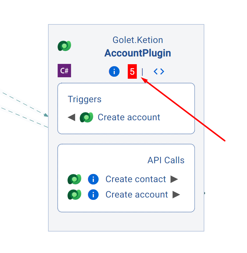
Users can find these violations in the 'Best Practices Check' feature as well as in the visualization. In the example below, you can see that the 'AccountPlugin' component has 5 best-practice violations, indicated by a red rectangle with a number representing the count of violations.
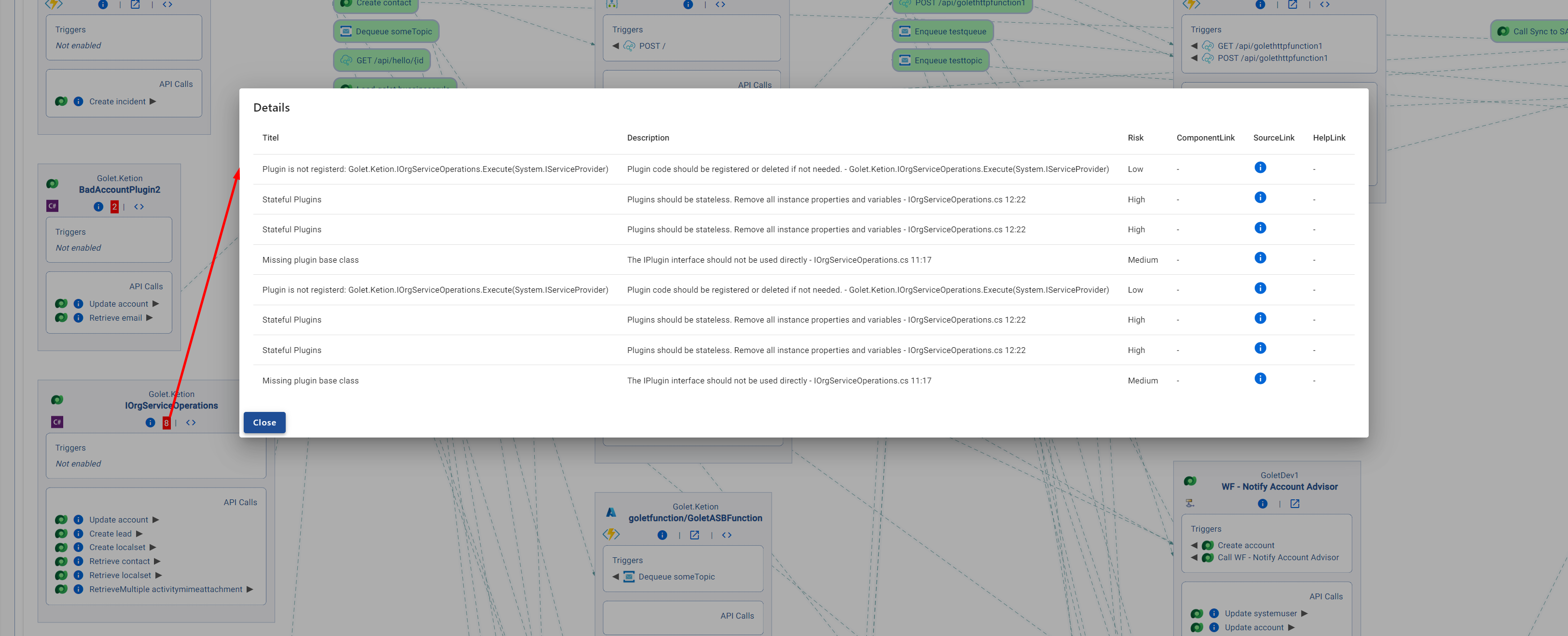
To view more information about the Best Practice Violations of the component, simply click on the red rectangle, and a pop-up with additional details will appear (see screenshot below)
Saved Reports
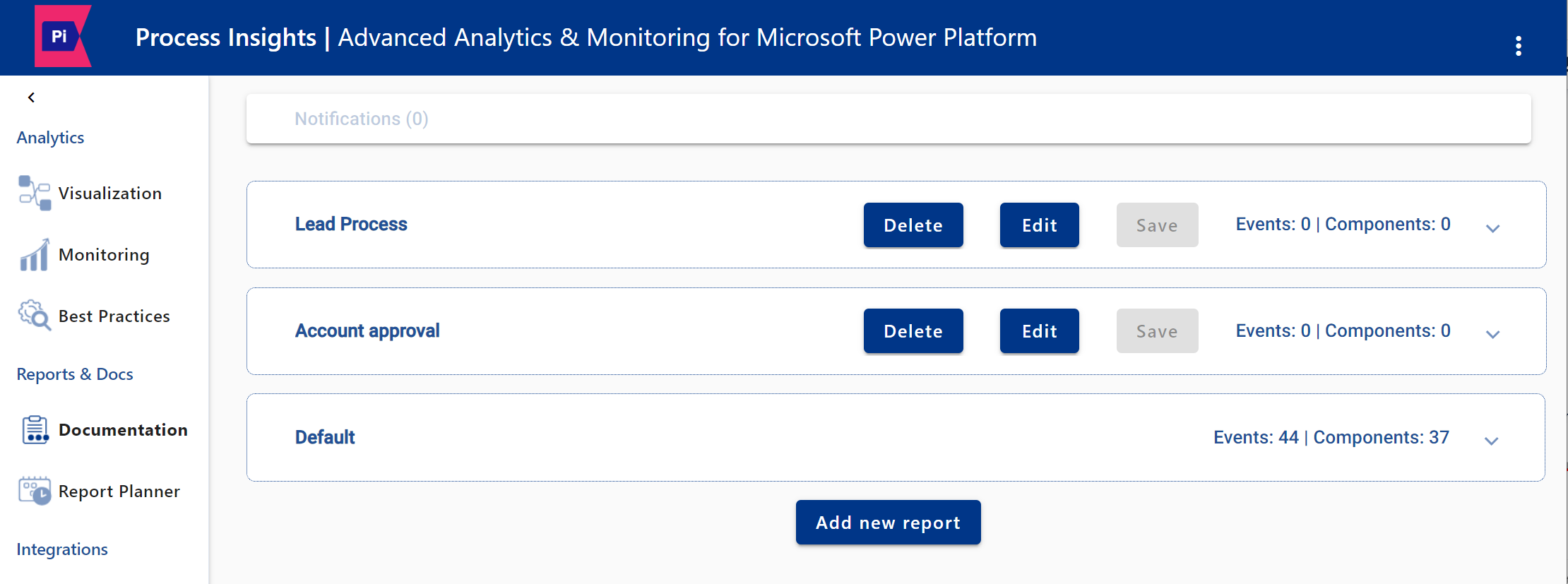
All visualizations can be saved as a report:
Default Report
The Default Report offers insights into all system components. It contains two report types:
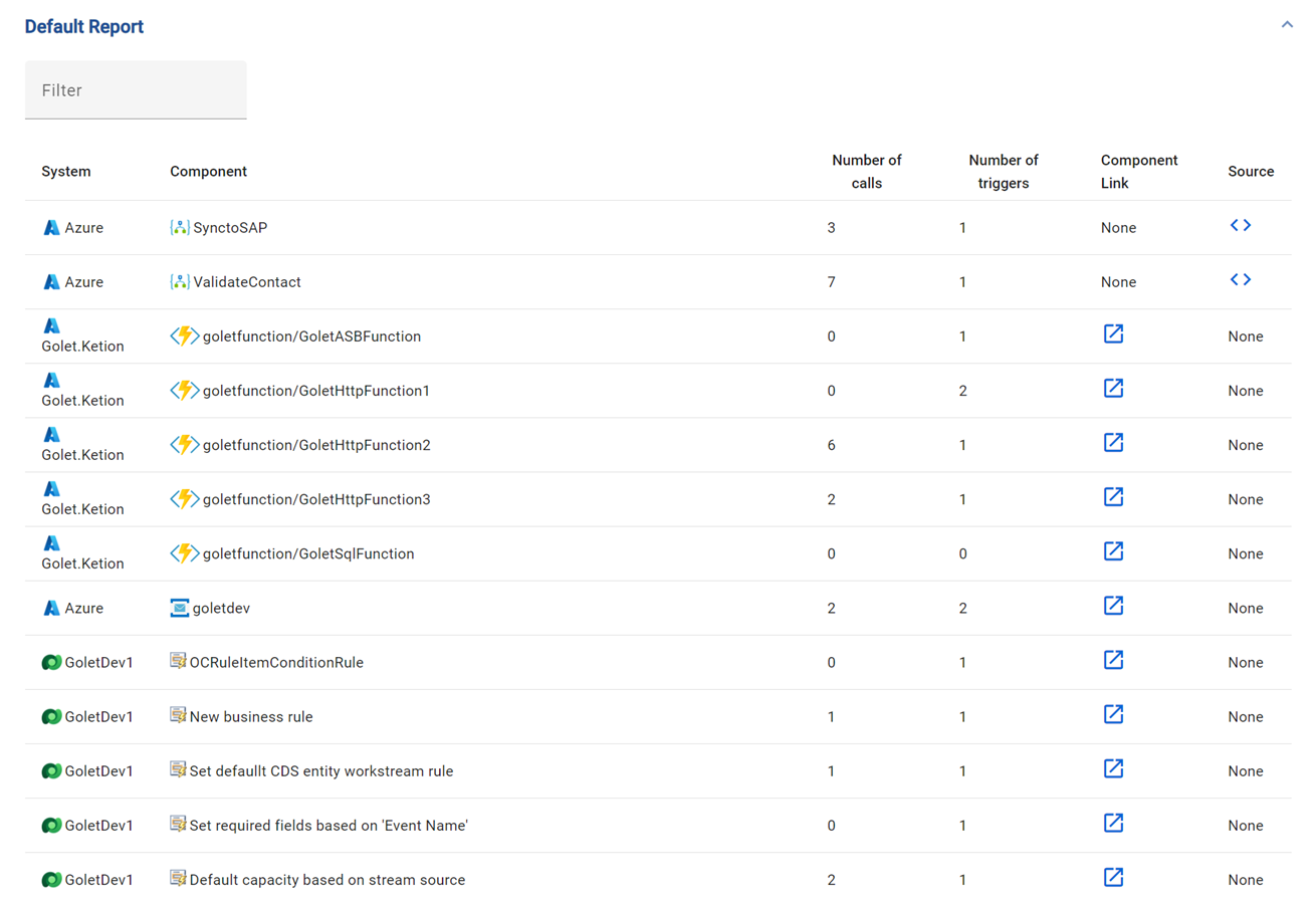
Default Report List: A detailed list of components offering key system insights, searchable by name.
Visualization Report: A comprehensive diagram that illustrate the interconnectivity and dependencies of all components.
Default Report List
The Default Report List provides a comprehensive overview of the global system.
System: Identifies the specific system to which each component belongs, clarifying its role in the infrastructure.
Component: Differentiates components by name and type, such as Azure Function, C# code, or D365 object.
Number of calls: Shows how many access points a component has for different kind of events, highlighting interdependencies.
Number of triggers: Shows the number of entry points a component has to other events, aiding in the assessment of system criticality and reliability.
Component Link: Provides a direct link to a component for quick reference and deeper investigation.
Source Code Link: Direct access to a component's source code for in-depth analysis.
Real-life Example
System: Azure from the Golet.Ketion Project (Example Project)
Component: Azure Function named GoletHTTPFunction3
Number of calls: The GoletHttpFunction3 has two APICalls
Number of triggers: The Azure Function is triggered by one other component
Component Link: Click to access the component
Source: Click to view the source code of the component
Default Report Visualization
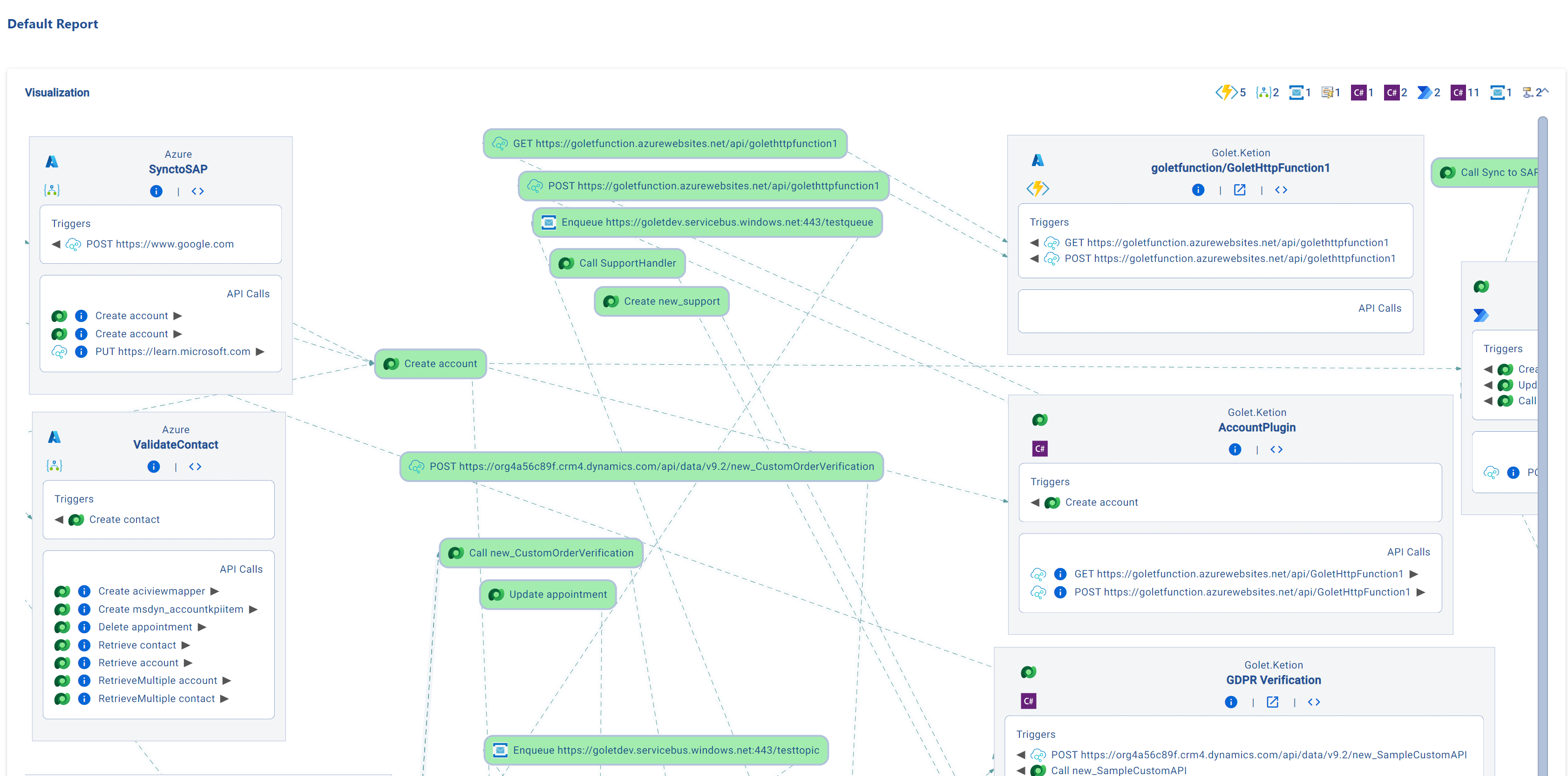
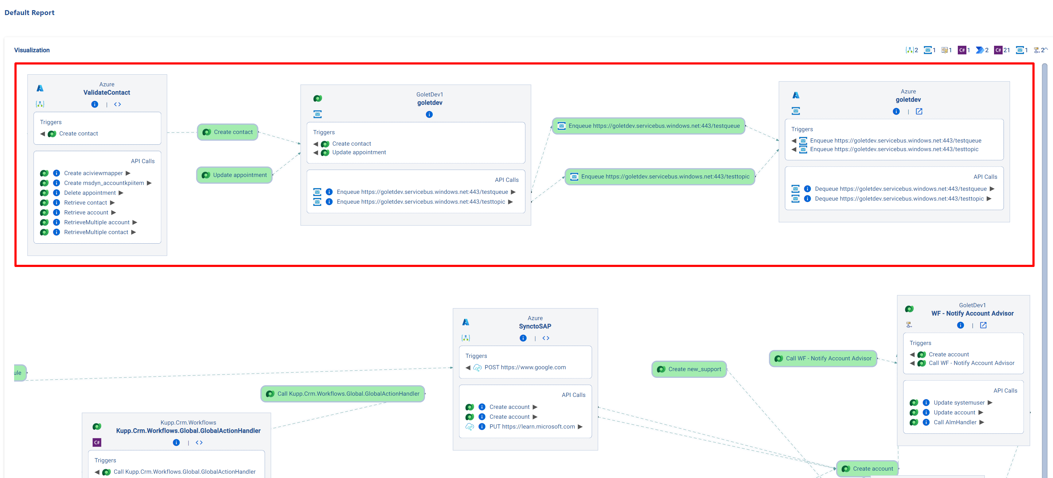
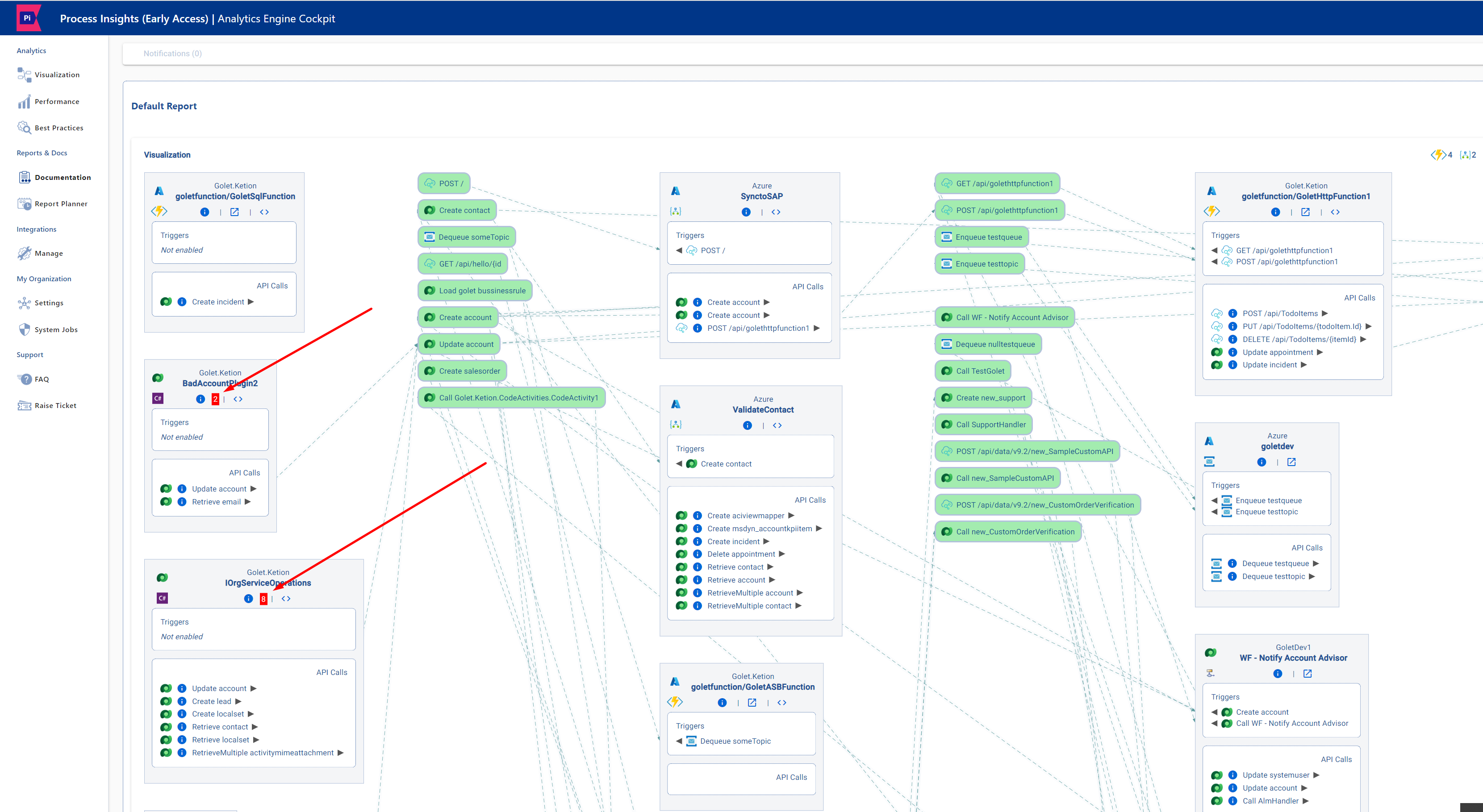
System components are visualized in detailed diagrams, simplifying connectivity understanding. Users can rearrange components and events, improving clarity. For example, users can focus on the account creation process by rearranging components and events in the Default Report or search for the specific component.
Additional component info is accessible by clicking "i" or "<>" icons.
Standard Default Report Visualization
The standard default report offers a holistic overview, providing a clear and informative snapshot of your system
Specific Process Analysis
Enhance analysis by adjusting and organizing components and events to focus specifically on chosen processes.
Detailed Component Information
See more at: Process and Logic Visualization | Step by Step Instructions
Best-practice Violations
Components with “Best Practice Violations” are represented by a red rectangle with a number indicating the count of violations within the component (See more: Best-practice Check)
A simple click on the rectangle opens a window displaying detailed information about the component's violations (see screenshot below)
Differentiate between Components and Events
Glossar | Components: depicted as gray boxes, include entities like D365-Objects, Azure Functions, or C# entry points (e.g., Plugin, WebApi, ConsoleApp).
Glossar | Event: depicted as green boxes, include items such as Triggers or, in this example, HTTP calls.
